
In the world of design, color schemes are far more than just a decorative tool. They are powerful elements that influence how users experience a product, navigate a website, or perceive a brand. Color choices can evoke emotions, guide user actions, and impact the overall feel of a design. For businesses, color schemes are integral to establishing a strong visual identity and influencing customer behavior. But how exactly do color schemes influence user experience and brand perception? In this article, we will dive deep into the psychology of color, its effect on design, and how it shapes user interactions and brand impressions.
Key Takeaways
- Color schemes have a profound impact on both user experience and brand perception by influencing emotions, guiding actions, and creating a memorable identity.
- Understanding color psychology can help you choose the right colors to evoke specific emotions and align with your brand’s values.
- Consistent use of color builds brand recognition and fosters trust with customers.
- When designing, ensure your color choices offer sufficient contrast for readability and accessibility across diverse audiences.
- A thoughtful and well-executed color scheme enhances the overall design, driving engagement and strengthening the connection between users and brands.
The Psychology of Color in Design
Understanding Color Psychology
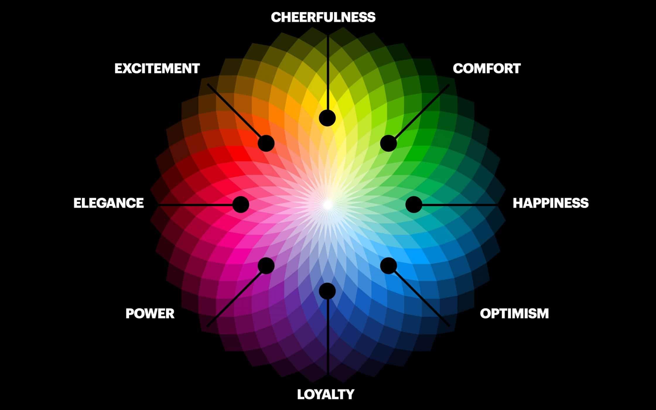
Color psychology refers to how colors affect human emotions, behaviors, and perceptions. Different colors evoke different emotional responses, and this effect can be harnessed to shape the user experience. For instance, blue is often associated with trust and calmness, making it a popular choice for financial institutions, while red is energizing and attention-grabbing, often used to stimulate action or urgency.
The psychological effects of colors are not universal—they can vary based on cultural contexts, personal experiences, and individual preferences. However, some colors tend to have widely accepted associations that are generally consistent across most cultures.
Warm vs. Cool Colors
Colors can generally be categorized into two groups: warm and cool.
- Warm colors like red, orange, and yellow are known to create excitement, warmth, and energy. These colors tend to be used in designs where action or attention is required. Red, for example, can be used to incite urgency (such as in sale advertisements), while yellow can invoke feelings of optimism and happiness.
- Cool colors like blue, green, and purple tend to be calming and soothing. Blue is often used in professional settings to convey trust and reliability, while green is associated with health, nature, and tranquility. Cool colors are ideal for designs aiming to create a sense of calm or to represent professionalism and serenity.
How Color Schemes Affect User Experience
The Role of Color in Navigation
Color schemes are crucial in guiding users through a design and influencing their navigation decisions. A well-thought-out color palette can highlight key information, call-to-action buttons, and important sections of a website or app. By using contrast effectively, designers can draw attention to elements that require immediate action, such as purchase buttons or subscription forms.
For example, an e-commerce site might use a bold red color for the “Add to Cart” button to encourage action. On the other hand, using neutral tones for background and text elements helps prevent visual overwhelm, allowing users to focus on essential actions without distractions.
The Impact of Color on Readability
One of the most important considerations in choosing a color scheme is ensuring that it supports readability. Contrast between background colors and text is essential for legibility. A high contrast color scheme—such as black text on a white background—ensures that users can easily read and absorb information.
However, it’s important to be mindful of color blindness when selecting color schemes. Approximately 8% of men and 0.5% of women worldwide experience some form of color blindness, with red-green color blindness being the most common. Designers should choose color palettes that provide sufficient contrast and avoid relying on colors alone to convey important information, using additional visual cues like icons or labels.
Emotional Impact and Engagement
Color schemes can also influence how users feel when interacting with a design. A well-chosen color palette can create a more engaging experience, making users feel more connected to the content. For example, websites with vibrant colors and dynamic palettes tend to be more engaging and evoke excitement. On the other hand, minimalist designs with muted tones often convey sophistication and calm, which may appeal to users seeking a more professional or serene experience.
A warm and vibrant color palette may be ideal for a lifestyle blog or an entertainment app, whereas a cool and subdued color scheme might be better for a healthcare website where trust and calmness are the desired emotions.
Color Schemes and Brand Perception
Establishing Brand Identity
Color schemes are one of the most powerful tools in establishing and reinforcing a brand’s identity. When consistently applied across various touchpoints—such as a website, logo, packaging, and advertisements—a color scheme becomes synonymous with a brand. This allows consumers to quickly identify the brand and develop an emotional connection.
For example, Coca-Cola’s red and white color scheme is instantly recognizable and associated with excitement and joy, while Apple’s sleek, minimalist palette of white and silver reflects innovation, sophistication, and simplicity. The consistent use of these colors across all brand materials strengthens the brand’s identity and makes it memorable.
Color Choices and Brand Values
Colors communicate not only the personality of a brand but also its core values. A green color scheme, for instance, can communicate a brand’s commitment to sustainability and eco-friendliness. Brands like Whole Foods and Patagonia use green to evoke associations with nature and environmental responsibility.
Conversely, a gold or black color palette might convey luxury, exclusivity, and sophistication, which brands like Rolex or Chanel use to target high-end consumers. By aligning color choices with the values and goals of the brand, designers can create a visual identity that resonates with the target audience and reinforces the brand’s message.
Consistency Across Platforms
For a brand to be effective, its color scheme must remain consistent across various platforms and media. Whether a consumer is interacting with a website, a mobile app, or a print advertisement, the colors should always be recognizable and consistent. This consistency builds trust and reinforces brand recognition. If a brand changes its color scheme too often, it may confuse or alienate customers, weakening its overall impact.
How to Choose the Right Color Scheme for Your Design
Understanding Your Audience
When selecting a color scheme, it’s crucial to understand your target audience and their preferences. Different demographics can have different emotional associations with colors. For example, younger audiences may be drawn to bright, bold colors, while older audiences may prefer more muted tones. Similarly, the cultural context of your audience can influence their perception of colors. In some cultures, white is associated with purity, while in others, it may symbolize mourning.
A deep understanding of your audience’s values and cultural context will guide your color choices to create a design that resonates with them emotionally and cognitively.
Considering the Nature of the Brand or Product
The type of product or service you are offering should also inform your color scheme. For example, if you are designing a healthcare website, calming and soothing colors such as soft blues and greens will work well to establish trust and tranquility. For a fitness brand, vibrant and energetic colors like orange and yellow may be more appropriate to reflect vitality and enthusiasm.
If you are designing for a creative brand or a fashion company, you may have more freedom to experiment with colors and trends. However, a financial institution or legal firm will typically rely on more neutral, professional color schemes that evoke trust and stability.
Using Color Harmonies
When choosing colors for your design, consider using color harmonies, which are combinations of colors that are aesthetically pleasing when used together. Some popular color harmonies include:
- Complementary colors: Colors that are opposite each other on the color wheel, such as red and green.
- Analogous colors: Colors that are next to each other on the color wheel, like blue and green.
- Triadic colors: Three colors that are evenly spaced around the color wheel, like red, yellow, and blue.
Using color harmonies ensures that your design feels cohesive and balanced, helping guide the user’s attention and making the interface visually appealing.
The Role of Color in Mobile App Design
Color schemes play a significant role in mobile app design, influencing user experience and overall usability. Mobile interfaces are typically more compact than desktop designs, so the choice of colors can impact the readability and flow of the app. Vibrant, high-contrast colors can draw attention to key elements such as buttons or calls to action, improving the overall user interface (UI) design. However, designers need to balance bold colors with softer tones to avoid overwhelming users and ensure that important content remains legible. Color also helps to convey the brand’s identity, so it’s important to ensure consistency across all screens within the app to create a unified and cohesive experience.
How Color Affects Consumer Behavior in Marketing
Color is a powerful tool in influencing consumer behavior, particularly in marketing and advertising. Studies show that different colors can evoke specific emotions or actions from consumers, which brands can leverage to increase engagement and sales. For example, red is often used to create a sense of urgency, which can drive consumers to take immediate action, such as making a purchase. Green, associated with health and wellness, is often used by brands in the organic and eco-friendly sectors. Understanding how different colors can influence buying decisions allows marketers to create more effective campaigns that resonate with their target audience.
The Influence of Color on Website Conversion Rates

The choice of color scheme on a website can significantly affect its conversion rate. Color influences how users interact with website elements, including buttons, links, and forms. A study by HubSpot found that websites with properly optimized color schemes for calls to action (CTA) buttons experienced better conversion rates. For example, using a bright, contrasting color for a CTA button helps it stand out against the background, drawing attention and prompting users to take action. Additionally, color can enhance trust and professionalism, which are essential for persuading visitors to convert into customers. The key is to ensure that the color scheme aligns with the brand and creates a visually appealing and user-friendly experience.
How Colors Affect User Emotions in Digital Designs
Colors have a strong impact on human emotions, and this psychological effect is especially important in digital design. Different colors can evoke positive or negative feelings, which directly influence how users feel when interacting with a website, app, or marketing material. For example, blue tends to create a feeling of trust and calm, making it ideal for financial or health-related websites. On the other hand, yellow is associated with optimism and energy, which may be a good choice for brands targeting a younger audience or seeking to communicate excitement. The emotional impact of color should be considered in every aspect of digital design to ensure that the user experience aligns with the desired brand message.
The Science Behind Color Selection in Branding
When selecting colors for branding, it’s important to understand the science behind how colors influence perception. Studies have shown that colors can evoke certain responses based on associations built through culture and experience. For example, red often triggers feelings of passion or urgency, which makes it an effective choice for promotions or sales events. Blue, on the other hand, is linked to security and reliability, making it the go-to choice for brands in industries like banking or insurance. By choosing the right colors, businesses can shape how their brand is perceived, whether they want to convey luxury, friendliness, trust, or excitement.
The Impact of Color in Logo Design
Logo design relies heavily on the strategic use of color to convey a brand’s identity and values. The right color in a logo can make it more memorable and emotionally resonant with the audience. For example, many tech companies use blue to convey trust and innovation, while eco-friendly brands often lean towards green to emphasize sustainability. The combination of colors in a logo must be carefully balanced to ensure it stands out in a competitive market and conveys the brand’s core message effectively. Beyond just visual appeal, the colors in a logo help create a lasting emotional connection with consumers, influencing how they feel about the brand.
How Color Harmony Enhances User Experience
Color harmony refers to the use of complementary or analogous colors in design to create a visually pleasing experience. A harmonious color palette ensures that the design elements work together, leading to a cohesive and balanced appearance. When colors are in harmony, users are more likely to have a positive visual experience, making them more comfortable and engaged. Designers often use color harmonies, such as complementary (opposite colors on the color wheel) or analogous colors (colors next to each other), to create a balance between contrast and cohesion. This approach ensures that the user experience remains aesthetically appealing without causing visual fatigue.
Color Accessibility and Its Importance in Design
Designing with color accessibility in mind is essential for ensuring that all users, including those with visual impairments, can easily engage with your content. Approximately 8% of men and 0.5% of women worldwide suffer from color blindness, which can make it difficult for them to distinguish between certain colors. Ensuring that color schemes have sufficient contrast and are used in conjunction with other visual cues, such as text labels or patterns, improves accessibility. Designing for color accessibility not only helps a wider audience but also shows that your brand values inclusivity. Tools such as color contrast checkers can help designers ensure that their color choices meet accessibility standards.
The Role of Color in Mobile Website Design
When it comes to mobile website design, color plays an even more crucial role due to the limited screen space. Designers must ensure that their color schemes not only align with the brand’s visual identity but also improve usability on smaller screens. Colors can be used to prioritize important actions, such as adding items to a shopping cart or completing a form. Additionally, mobile users often expect quick loading times, and color schemes that are too complex can slow down the performance of a website. Simple, contrasting colors work best for improving usability and creating a seamless experience across mobile devices.
The Future of Color in Design Trends
As technology evolves, so do color trends in design. The future of color in design will likely see more focus on user personalization, with color schemes being adapted based on user preferences or even environmental factors. There is also a growing interest in using bold, experimental color combinations, especially with advancements in digital screens that offer enhanced color accuracy. Additionally, neon and metallic hues are gaining popularity in certain industries, particularly in tech, entertainment, and fashion. The continued evolution of color technology and design tools will allow designers to experiment with new ways to engage users and communicate brand messages through color.
The Importance of Color in User Interface (UI) Design
Color plays a pivotal role in user interface (UI) design, affecting how users interact with digital platforms. UI design must be functional and visually appealing, and color can enhance both aspects. By strategically using color, designers can create intuitive interfaces that guide users through navigation, making the experience smoother and more enjoyable. For instance, using contrasting colors for buttons and backgrounds helps important elements stand out, while muted colors for backgrounds prevent visual overload. A thoughtful UI color scheme can also communicate a sense of order and hierarchy, allowing users to focus on key actions without unnecessary distractions.
The Relationship Between Color and Branding in Digital Design
In digital design, color is a crucial component of brand identity. A consistent color palette helps to establish recognition and differentiation in a crowded market. For example, social media platforms like Facebook and Twitter use specific shades of blue to communicate trust, dependability, and professionalism. Similarly, brands like McDonald’s use red and yellow to create excitement and urgency. Color communicates not just aesthetic appeal but the core values of a company. Choosing the right color scheme for a brand is an integral part of creating an emotional connection with the target audience, ensuring that the brand resonates positively across different platforms.
How to Create a Color Scheme That Reflects Your Brand’s Personality
Creating a color scheme that reflects a brand’s personality is a critical step in the design process. The colors you choose should align with the values and emotions your brand wants to convey. A playful brand may use bright, energetic colors like orange or yellow to communicate fun, while a luxury brand may opt for deep, rich tones such as gold or navy to suggest sophistication and exclusivity. It’s important to understand the psychological impact of colors and how they affect perceptions. For example, green suggests sustainability and growth, making it perfect for brands with a focus on environmental responsibility. A well-crafted color scheme can instantly communicate the essence of a brand to its audience.
The Role of Color in Creating a Strong Visual Hierarchy
Color is a powerful tool for creating a strong visual hierarchy in design, guiding users’ attention to the most important elements of a page or screen. By using different shades, contrasts, and intensities of colors, designers can draw focus to specific areas, such as call-to-action buttons or navigation menus. For example, a vibrant color can be used for key actions like “Sign Up” or “Shop Now” to make them stand out against a neutral background. This subtle use of color helps prioritize content and makes it easier for users to navigate through complex interfaces. A clear visual hierarchy improves usability and enhances the overall user experience, making the design more efficient and intuitive.
Color Trends in Web Design: What’s Next?
Web design is always evolving, and so are color trends. The future of web design will likely see an increasing shift towards minimalistic color schemes that focus on clean, neutral tones paired with accent colors for emphasis. Soft pastels and muted hues are becoming popular as they create a calming, less cluttered feel, especially in professional and health-related websites. Additionally, with the rise of dark mode interfaces, designers are embracing darker backgrounds with light text and vibrant accent colors to reduce eye strain while still creating a visually appealing experience. Keeping up with color trends is essential for staying relevant in the fast-paced world of web design, ensuring that your designs appeal to modern users.
The Impact of Color in Social Media and Digital Marketing
Color schemes in social media and digital marketing are critical to engaging the target audience and conveying the right message. Brands use specific color palettes across their social media channels to maintain a cohesive identity. For instance, Instagram’s use of vibrant pinks, purples, and oranges reflects its youthful, creative, and dynamic personality. Digital marketing campaigns often rely on bold colors to grab attention quickly and spark interest. In email marketing, the right color choices can increase open rates, as colors can make subject lines more enticing. Furthermore, color schemes can influence emotional reactions and consumer decision-making, making it a vital consideration when designing digital marketing materials.
How to Use Color to Enhance Website Accessibility
Ensuring that a website is accessible to all users, including those with visual impairments, is a critical aspect of web design. Color schemes that offer high contrast between text and background can improve readability for people with low vision or color blindness. For instance, using dark text on a light background or vice versa makes the content easier to read. Designers should also avoid relying solely on color to convey meaning, as users with color blindness may not be able to distinguish between certain shades. By using patterns, textures, or icons alongside colors, designers can create more accessible websites that can be enjoyed by a wider audience, regardless of their visual abilities.
The Role of Color in E-commerce Design
Color plays an essential role in e-commerce design, influencing both user behavior and conversion rates. In an e-commerce environment, color schemes must be chosen carefully to enhance the shopping experience and encourage purchasing decisions. Bright, contrasting colors can draw attention to important elements, such as product images, prices, and call-to-action buttons like “Add to Cart” or “Buy Now.” For instance, red can create a sense of urgency, often used in limited-time promotions or sales, while green can suggest security and trust, reassuring customers about the safety of their transactions. The right color choices can guide the user smoothly through the buying process, leading to higher conversion rates.
The Role of Color in Creating Emotional Connections with Users

Colors are not just visually appealing—they evoke emotional responses that can help create a deeper connection with users. When designing for a specific emotional outcome, such as excitement, trust, or relaxation, the right color choices can significantly influence how users feel about the brand. For example, blue tends to foster trust and loyalty, making it a go-to color for banks and healthcare brands. Yellow, associated with happiness and energy, can create a positive emotional connection with users, making them feel motivated or uplifted. By understanding the psychological effects of color, designers can craft experiences that resonate with users on a deeper emotional level, ultimately driving engagement and brand loyalty.
Color as a Tool for Branding Consistency Across Platforms
For a brand to establish itself successfully in a competitive market, consistency across all touchpoints is key. Color plays an essential role in this consistency, as it helps tie together various elements of branding, such as logos, websites, packaging, and advertising. Whether a customer interacts with a brand online, in print, or in a physical store, maintaining a consistent color scheme ensures that the brand feels unified and recognizable. If a company uses different color schemes across different platforms, it can confuse customers and weaken brand identity. A consistent and cohesive color palette enhances the user experience and fosters brand recognition across all marketing channels.
The Effect of Color in User Feedback and Satisfaction
Color can also impact how users respond to feedback and communication within an interface. For instance, success or error messages are often color-coded—green indicating success and red indicating an error. These color cues help users quickly understand the outcome of their actions and guide them toward the next steps. The use of color in feedback messages can reduce confusion and improve the overall user experience. A calm, professional color like blue can make users feel confident when submitting forms or finalizing purchases, while overly bright or jarring colors may create anxiety or frustration. Using color thoughtfully in user feedback mechanisms enhances satisfaction and supports a positive relationship with the platform.
Read more:- How Does Font Choice Impact The Readability And
Conclusion
Color schemes are a critical element in design that can profoundly influence both user experience and brand perception. The psychology of color, its emotional impact, and its ability to guide user behavior make it an essential tool for creating effective designs. A carefully chosen color palette can enhance readability, improve navigation, and reinforce brand identity, helping businesses establish a strong visual presence in the market. Whether you are designing a website, a logo, or a marketing campaign, understanding the power of color will allow you to create a design that resonates with your audience and supports your brand’s goals.
FAQs
1. Why is color important in design?
Color influences how users perceive a design, affects their emotions, and guides their actions. The right color scheme can make content easier to read, enhance brand identity, and create an overall more engaging user experience.
2. What does blue represent in design?
Blue is often associated with trust, professionalism, and calmness. It is commonly used in corporate branding, especially in industries like finance, healthcare, and technology.
3. How can color schemes impact user behavior?
Color schemes can guide users’ actions by highlighting important elements, like call-to-action buttons, and creating a sense of urgency or calm. For example, a red button may encourage users to take immediate action, while blue can make them feel secure and comfortable.
4. What are the best colors for a website?
The best colors depend on the website’s purpose and target audience. However, most websites benefit from a neutral background with contrasting text, such as black or dark gray on white, with accent colors used for important elements like buttons and links.
5. Can color schemes improve accessibility?
Yes, choosing high-contrast colors between text and background can improve accessibility for users with visual impairments. It is also essential to avoid relying on color alone to convey important information.
6. How does color influence brand perception?
Color can shape how consumers perceive a brand’s values, personality, and reliability. Brands that use color consistently help reinforce their identity and establish trust with their audience.
7. What color scheme should I use for a luxury brand?
For luxury brands, rich, deep colors like black, gold, and navy blue are commonly used to convey sophistication, exclusivity, and high-end appeal.