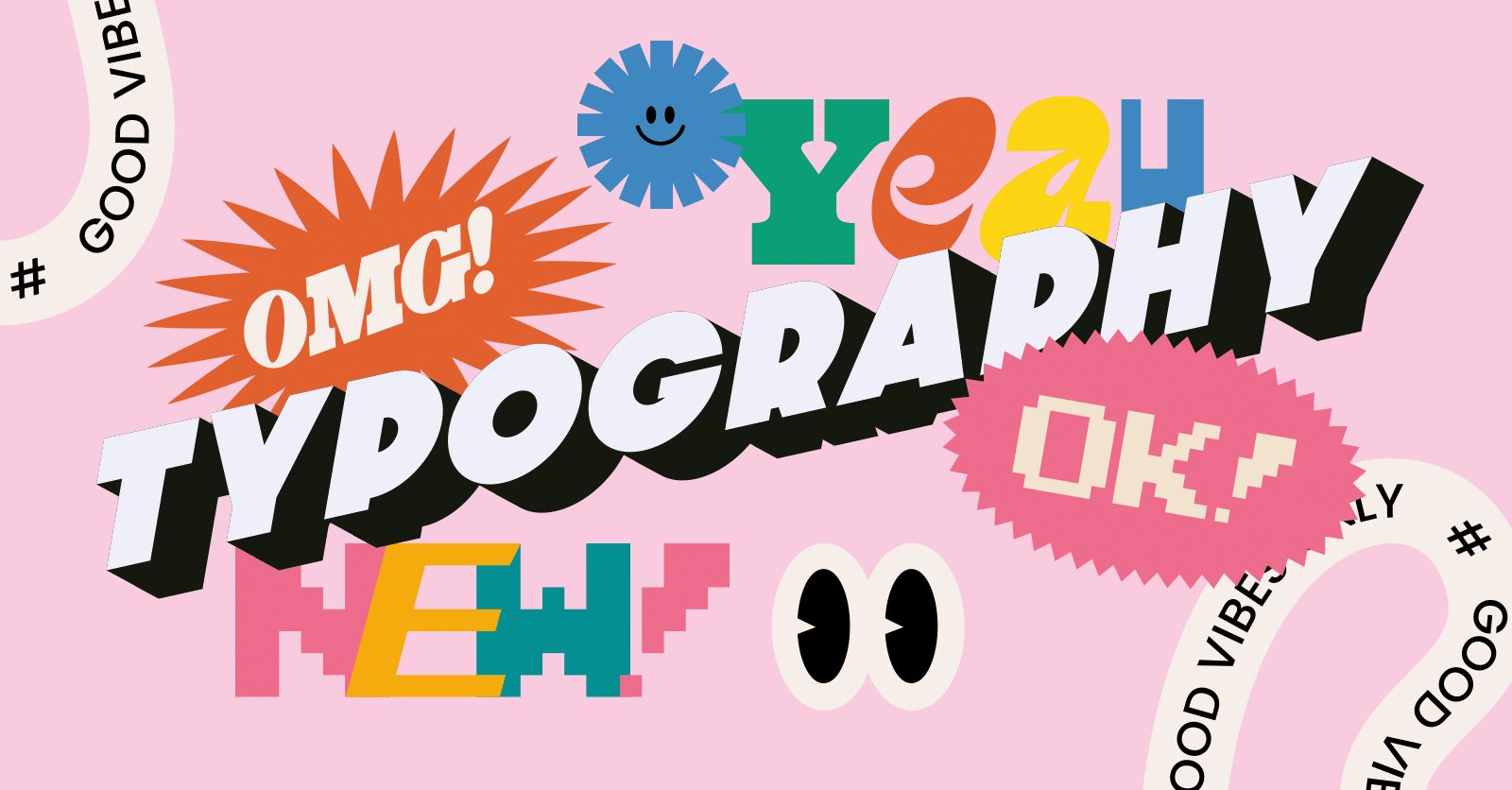
When it comes to design, whether for websites, advertisements, posters, or any other form of visual communication, font choice plays an undeniable role. The typeface used can drastically affect how information is perceived, how easily it is read, and even the overall mood of the design. But how exactly does font choice impact the readability and tone of a design? In this article, we will explore how typography influences these key design elements, the science behind it, and why it matters to both designers and audiences.
Key Takeaways
- Readability depends on font size, style, and spacing, which together ensure a seamless reading experience.
- Font choice plays a major role in conveying the tone of your design—whether it’s playful, professional, or elegant.
- Understanding the psychological effects of different fonts can help you strategically communicate with your audience.
- Always test your font choices across platforms to ensure they enhance the overall design and achieve the desired effect.
The Importance of Readability in Design
What is Readability?
Readability refers to how easily text can be read and understood. Factors influencing readability include font style, size, weight, line spacing, and contrast against the background. A font choice directly impacts these elements, making it either easier or harder for users to digest the information presented. A good readable font should allow the reader to glide through text effortlessly, without unnecessary strain or confusion.
Why Readability Matters?
Imagine trying to read a website with tiny, condensed text on a busy background. The experience is frustrating, and most likely, the user will leave the page in search of something more accessible. Readability ensures that the user’s experience is pleasant and intuitive, facilitating the absorption of information. Without readability, even the most powerful message or content can be lost.
Fonts like serifs (e.g., Times New Roman) and sans-serifs (e.g., Arial, Helvetica) each have specific roles depending on their characteristics. Serif fonts often evoke a more traditional, formal feel, while sans-serif fonts can lend a more modern and clean look to the design. The wrong font choice could cause visual clutter, which may detract from a clear message.
How Font Size and Style Affect Readability
Font size is crucial to readability—text that is too small may be unreadable, while text that is too large can overwhelm the design and cause the user to skim over important details. A good balance of font size enhances ease of reading. Typically, body text should be at least 16px in size on a screen to ensure comfort for the reader.
The style of a font can also affect its legibility. Decorative fonts may look beautiful and creative, but when overused or applied in long passages of text, they can be difficult to read. For example, a cursive-style font may look elegant for a wedding invitation but could become a hindrance when used for a product description on a website.
How Does Font Choice Influence the Tone of a Design?
Understanding the Tone of a Design
Tone refers to the emotional quality or atmosphere conveyed through a piece of design. Whether playful, formal, or professional, the tone influences how the audience feels about the content. Font choice can directly alter the tone of your design, sometimes more powerfully than images or colors.
Serif vs. Sans-Serif Fonts: Tone and Application
- Serif Fonts: Serif fonts (those with small lines or strokes attached to the end of a larger stroke in a letter or symbol) tend to convey a sense of tradition, professionalism, and reliability. They are often used in newspapers, books, and other print media. These fonts are perceived as more formal and authoritative, which is why they are commonly associated with businesses, academic writing, and legal documents.
- Sans-Serif Fonts: Sans-serif fonts, which lack the small decorative strokes at the end of letters, are typically viewed as modern, clean, and approachable. These fonts are ideal for digital content, like websites or apps, because they tend to read more easily on screens. They are informal and youthful and thus frequently used in tech and fashion industries.
Choosing Fonts to Match the Message
The tone you wish to convey in a design can be shaped by the fonts you choose. For example:
- Playful and Fun: Fonts like Comic Sans or playful handwritten styles give off a lighthearted, casual vibe, perfect for children’s products, casual blogs, or entertainment brands.
- Luxury and Elegance: Fonts with delicate, cursive-like strokes or bold, high-contrast typefaces can invoke feelings of sophistication and high-end products. These fonts are often used in luxury brands, weddings, or high-fashion marketing materials.
- Professionalism and Authority: Traditional fonts such as Times New Roman or Arial help convey a serious and trustworthy tone, often used in corporate communications or academic articles.
Tone and Consistency in Branding
For brands, maintaining consistent tone and message is paramount. The font choice contributes significantly to this by reinforcing brand identity. Think of a tech startup—its design may use modern sans-serif fonts to evoke innovation and simplicity. On the other hand, a law firm’s branding would lean toward a classic serif font to convey trust, professionalism, and history. Fonts not only reflect the business but also shape consumer perception of it.
The Psychological Impact of Fonts
Typography goes beyond simple aesthetics; it can also have a psychological impact on the viewer. The perception of a font can trigger certain emotional responses, influencing how the content is received. For example, rounded fonts are often seen as friendly and approachable, while sharp fonts might appear more aggressive or authoritative.
Research on Font Psychology
Studies show that fonts can trigger different responses based on their shape and style. For example:
- Round fonts are associated with warmth, comfort, and openness. They are used in designs where you want to appear inviting and approachable.
- Sharp, angular fonts can convey strength, urgency, or modernity. They are often used in high-energy or action-driven designs.
- Thin, light fonts are often associated with elegance and sophistication, while bold fonts tend to express power, strength, or confidence.
Understanding these psychological impacts allows designers to choose fonts that align with the emotions they want to evoke in their target audience.
How to Choose the Right Font for Your Design
Factors to Consider When Choosing a Font
When selecting a font for your design, consider these factors to ensure that readability and tone align:
- Purpose: What is the primary goal of your design? Whether it’s informative, promotional, or creative, the font should reflect the purpose.
- Audience: Who is your target audience? Younger audiences might respond better to playful, modern fonts, while older demographics might appreciate more traditional fonts.
- Platform: Are you designing for print or digital media? Different platforms might require different font choices due to the way fonts appear on screens or in print.
- Brand Identity: Does the font align with your brand’s identity? Consistency is key in maintaining a strong visual brand presence.
Combining Fonts Effectively
Sometimes a design calls for the use of more than one font. For instance, you might choose a serif font for headings and a sans-serif font for body text. However, combining too many fonts can make the design feel cluttered and difficult to read. Stick to a maximum of two or three complementary fonts to maintain a clean, professional look.
Testing Your Font Choice
Once you’ve selected a font, it’s essential to test how it performs. Check for readability on various screen sizes and under different lighting conditions. For print designs, always print a proof to see how the font looks on physical media. Consider feedback from others to gauge how effectively your font communicates the tone of the design.
How Font Choice Enhances User Experience in Web Design
Font choice in web design significantly affects user experience by impacting readability and engagement. A well-chosen font can create an inviting atmosphere that makes users feel comfortable navigating a website, while a poor font can cause frustration and hinder accessibility. For example, fonts that are too ornate or difficult to read can make it harder for users to quickly absorb information. Conversely, fonts that are too generic can make the site feel uninspired. The right font balances style and functionality, making content easy to read while also reinforcing the brand’s identity. Web designers need to consider both legibility and aesthetic appeal when selecting fonts for different elements of the site, such as headings, body text, and calls to action.
The Role of Typography in Branding and Visual Identity
Typography plays a crucial role in branding, as it can significantly influence how a brand is perceived. The font choices in a logo, website, and other brand materials establish a visual identity that helps create a connection with the audience. A unique, well-chosen font can make a brand feel more trustworthy, professional, or fun, depending on the desired brand personality. For instance, sleek, modern fonts can make a tech company feel cutting-edge, while classic fonts can convey tradition and stability. Typography is not just about appearance; it’s about creating a lasting impression and reinforcing the brand’s values through a consistent, thoughtful design.
How Typography Affects Mobile Readability
With mobile usage on the rise, typography has become a critical element of mobile design. Small screens require careful attention to font size, line spacing, and contrast to ensure that content is legible and easy to read. Fonts that are too small or too tightly spaced can make reading on mobile devices a frustrating experience, especially for users with visual impairments. In contrast, fonts that are too large may cause excessive scrolling or make the content feel overwhelming. Designers need to select fonts that scale well across various devices, offering clarity and ease of reading while maintaining an aesthetic balance across all screen sizes.
The Impact of Font Pairing on Design Harmony
Font pairing refers to using two or more complementary fonts within the same design to create a cohesive look. Choosing the right font pair is essential to maintaining design harmony, as mismatched fonts can lead to visual clutter and confusion. A common approach is pairing a serif font with a sans-serif font, which creates contrast and keeps the design balanced. However, the key to effective font pairing lies in maintaining consistency in style, weight, and spacing to avoid overwhelming the viewer. A well-paired font selection ensures the design remains visually appealing, easy to navigate, and engaging for the audience.
Understanding the Role of Fonts in Advertising and Marketing
Fonts are essential elements in advertising and marketing campaigns because they set the tone for the message being communicated. The right typeface can evoke emotions that align with the campaign’s goals, whether it’s creating excitement for a product launch or communicating trust for a financial service. For example, bold, strong fonts are often used in advertisements to convey urgency or excitement, while softer fonts may be chosen for health-related campaigns to project calmness and reassurance. The typeface you use in your ads can influence how consumers perceive your brand, and by extension, their decision to engage with your product or service.
The Science Behind Typography and Cognitive Processing
Typography impacts cognitive processing in ways that affect how easily we can read and retain information. Different font styles and designs can either facilitate or hinder cognitive processing. Simple, legible fonts reduce the cognitive load, allowing readers to focus on the content without distraction. On the other hand, overly complex or intricate fonts can create cognitive strain, slowing down comprehension and retention. Studies show that fonts that are easy to read, such as sans-serif fonts, promote better understanding, while decorative fonts can slow down reading speed and make information harder to absorb.
How Font Choice Affects Accessibility in Design
When designing for accessibility, font choice becomes an essential consideration. Many individuals with visual impairments or cognitive disabilities rely on fonts that are clear, legible, and easy to distinguish. Fonts with high contrast between text and background, simple letterforms, and adequate spacing between characters improve the reading experience for all users. In addition, designers must consider font size, as text that is too small can be unreadable for users with low vision. Choosing fonts that prioritize accessibility ensures that your design is inclusive, allowing everyone, regardless of ability, to engage with the content effectively.
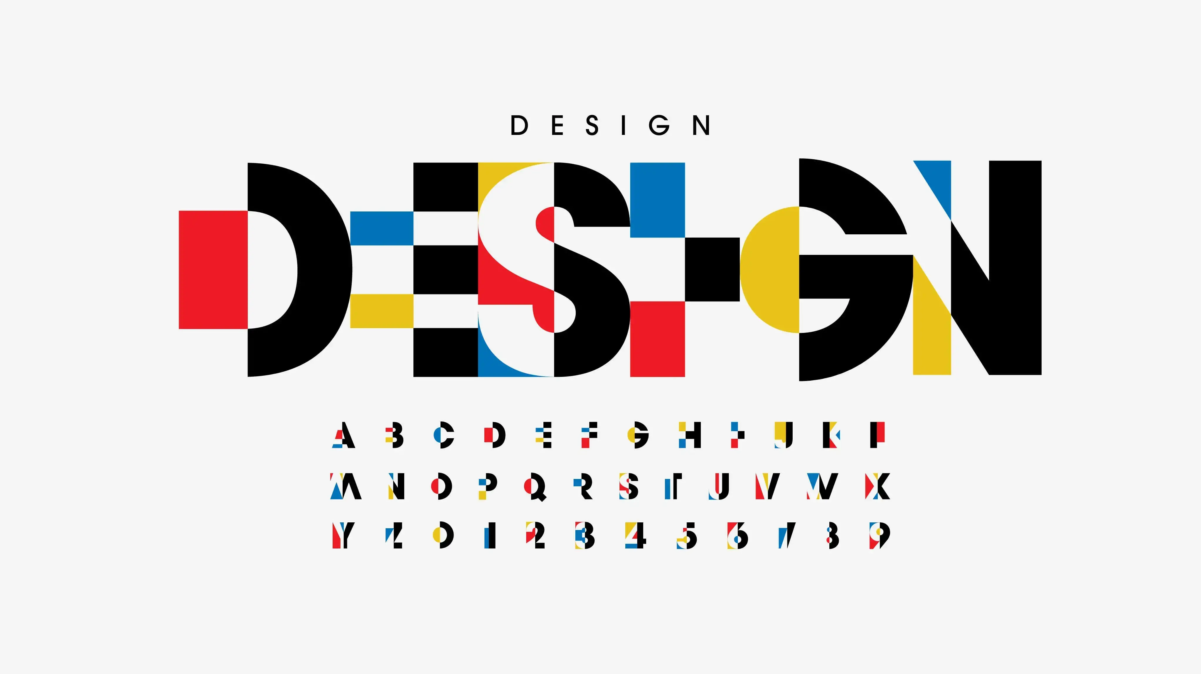
The Evolution of Font Trends in Graphic Design
Font trends in graphic design have evolved over the years, adapting to changing technology, cultural shifts, and design needs. In the early days of digital design, pixelated, bitmap fonts were popular due to the limitations of screens and technology. As graphic design software advanced, more versatile typefaces became available, allowing designers to experiment with various styles. Today, modern trends focus on minimalism, bold typography, and custom fonts that enhance brand identity. Understanding how these trends evolve helps designers choose fonts that stay relevant while still catering to contemporary tastes and expectations.
The Connection Between Font Choice and Website Performance
Font choice can have a surprising impact on website performance, particularly in terms of load times and user experience. Custom fonts and web fonts can sometimes slow down a website’s loading time, especially if they are not optimized correctly. This can result in a frustrating experience for users, leading to higher bounce rates. Web designers must consider the file size of fonts and ensure that they are efficiently loaded across all devices. By choosing web-safe fonts or using font loading techniques like “font-display” CSS property, designers can optimize both the appearance and performance of a site.
The Impact of Typography on Print Design
In print design, typography plays an essential role in ensuring the message is communicated clearly and effectively. Whether for books, magazines, brochures, or posters, the font selection directly affects readability and overall design quality. Print materials require fonts that are optimized for high-quality reproduction, as poor font choices can cause legibility issues. Additionally, typefaces used in print must work well with various printing techniques and materials to maintain their visual integrity. Typography in print design must be chosen carefully to complement the design and content, ensuring a professional and polished final product.
How Fonts Influence Emotional Design and User Response
Fonts have the power to evoke emotional responses from viewers, influencing their perception of a design and their behavior. A typeface that conveys elegance may evoke feelings of luxury, while a bold font might generate excitement or urgency. The emotional response triggered by a font is closely tied to its design characteristics, such as its shape, weight, and curvature. For example, rounded fonts often evoke warmth and friendliness, while sharp, angular fonts can convey strength or modernity. Understanding how fonts influence emotions allows designers to carefully craft experiences that align with the message they want to communicate.
Choosing Fonts for E-Commerce Websites
For e-commerce websites, font choice is critical not just for aesthetic appeal, but also for enhancing user experience and conversion rates. The right fonts can create a smooth browsing experience, making it easier for users to find products and navigate through the site. Legible fonts are crucial for product descriptions, reviews, and calls to action, as users need to quickly absorb this information before making a purchase decision. Sans-serif fonts are popular in e-commerce sites for their clarity, while bold fonts are often used for emphasizing important actions like “Add to Cart” or “Buy Now.” Font choices on e-commerce sites directly impact both user engagement and the likelihood of conversion.
How Font Choice Affects Social Media Graphics
In social media design, typography plays a key role in capturing attention and conveying messages effectively in a highly competitive environment. With the rapid pace of scrolling on platforms like Instagram, Facebook, or Twitter, a well-chosen font can make your post stand out. Bold, attention-grabbing fonts are often used for headlines, while simpler fonts are used for body text. The font should align with the tone of the brand and the specific post, whether it’s casual, playful, professional, or serious. Additionally, readability is essential, as text must be legible even on small mobile screens. A font that complements the visual elements of a post can increase engagement and help communicate the message more clearly.
The Role of Typography in Packaging Design
Typography plays a pivotal role in packaging design, as it is one of the first elements consumers interact with when seeing a product. The font choice in packaging can help convey the brand’s personality, attract attention, and influence buying decisions. For example, luxury products often use elegant, serif fonts to communicate quality and exclusivity, while organic products may use earthy, handwritten-style fonts to suggest authenticity and natural ingredients. In packaging design, typography must also consider space, legibility, and contrast to ensure that essential information such as product name, ingredients, and instructions are easily readable on various types of packaging materials.
The Challenges of Typography in Multilingual Design
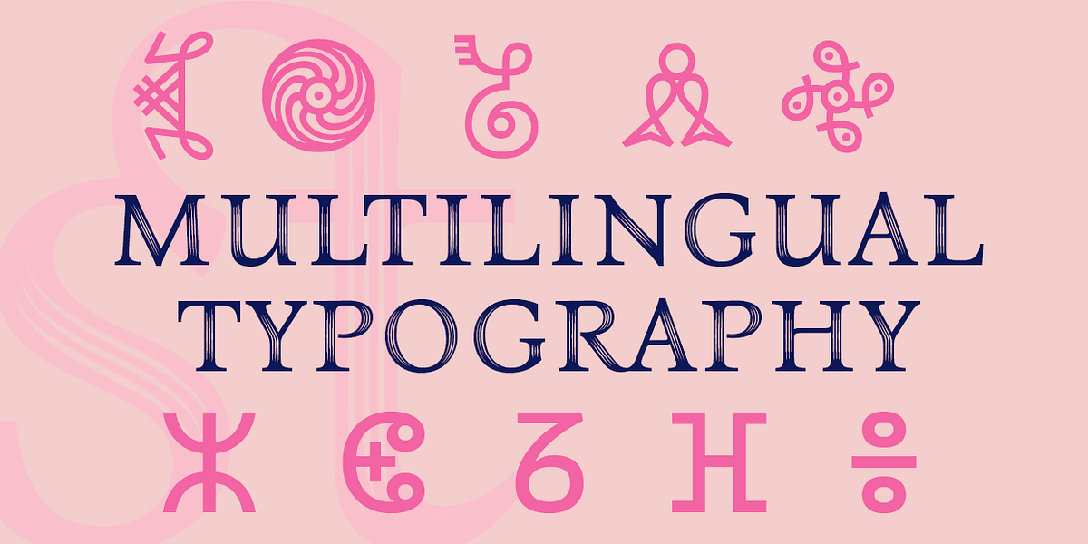
Typography becomes more complex when designing for multilingual audiences. Fonts that work well for one language may not be suitable for others due to differences in character sets and letter spacing. For example, Latin-based fonts may not render well for languages like Chinese, Arabic, or Cyrillic. Additionally, some languages may require adjustments to font weight, kerning, or line spacing to ensure that the text remains readable and visually balanced. When designing multilingual content, it’s essential to choose typefaces that support various languages and maintain legibility, while also ensuring that the design elements are consistent across all versions of the content.
The Intersection of Font Design and User Trust
Font design is more than just a creative element—it plays a significant role in building user trust. A font that is too ornate or difficult to read can create a sense of unprofessionalism or lack of credibility. On the other hand, clean, well-designed fonts help foster a sense of reliability and authority. In industries such as finance, healthcare, or law, fonts are chosen specifically to convey trust and security. A well-chosen font, paired with a thoughtful design, can build confidence in the user, making them more likely to engage with the content and take action. Thus, font design can influence how much users trust a brand or website, affecting their decision to interact with it.
Read More:- How Can Debit Card Benefits Help You Manage
Conclusion
Font choice is a powerful tool in design, affecting both readability and tone. From the psychological impacts of different styles to their ability to communicate specific emotions, fonts can enhance the user experience or create barriers to it. When selecting a font, always consider its readability, the tone you wish to convey, and how well it fits with your overall brand or message. With thoughtful font choices, you can elevate the impact of your design and ensure your content resonates effectively with your audience.
FAQs
1. What is the best font for readability?
Sans-serif fonts like Helvetica and Arial are often considered the best for readability on screens, while serif fonts like Times New Roman are highly readable in print.
2. How does font size affect readability?
A font that is too small can be difficult to read, especially on smaller screens. A font size of at least 16px is ideal for body text on digital platforms.
3. Can fonts influence the success of a brand?
Yes, fonts play a significant role in a brand’s identity. Consistent, appropriate font choices help build trust, recognition, and emotional connection with the audience.
4. What font should I use for my website?
Sans-serif fonts such as Arial, Helvetica, or Open Sans are popular choices for websites due to their clean and modern appearance, making them easy to read on digital screens.
5. Can a font make a design look outdated?
Yes, fonts can sometimes feel outdated if they are not kept in line with current design trends. Be mindful of using outdated fonts unless you intentionally want to evoke a nostalgic feeling.
6. Is it okay to use more than one font in a design?
Yes, but it’s important to combine fonts that complement each other. For example, pair a serif font for headings with a sans-serif font for body text.
7. How do I choose a font for my specific brand?
Consider the tone of your brand, the emotions you want to evoke, and your target audience. Choose a font that aligns with these factors to create a cohesive brand identity.